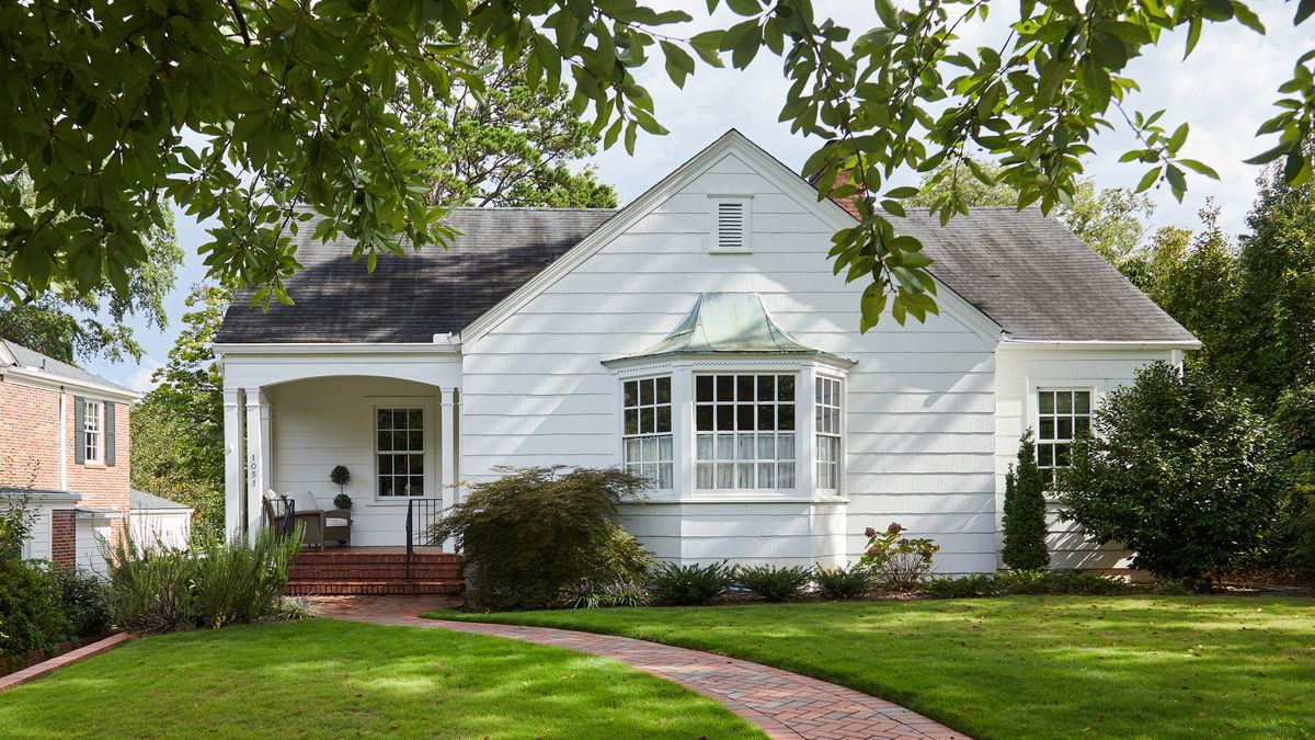
When a young couple’s charming 1942 home in Spartanburg, South Carolina, needed a new aesthetic direction, they called in Greenville designer Whitney McGregor for help. The result is so upbeat and fresh that McGregor says she would happily move right in. “In another world, I live here by myself,” McGregor laughs. “It’s happy and cozy and bright, and it’s reflective of my clients and their personality. They’re light and fun-loving.”
Inspired by glowy sunsets in the husband’s hometown of Wilmington, North Carolina, McGregor sourced shades of pink, goldenrod yellow, blue, and green. Mixed with cheering wallcoverings and fun fabrics, the result feels traditional but with an irreverent, youthful twist.
More From House Beautiful

“We focused on paint and furnishings primarily,” McGregor says. “I did what I could to not change everything. I used pieces they already had; then we swapped out the rest.”
Today the home’s refreshed palette reflects the couple’s authentic style. “I dug deep into their preferences, researched and studied their inspiration,” McGregor says. “I think it came through.”
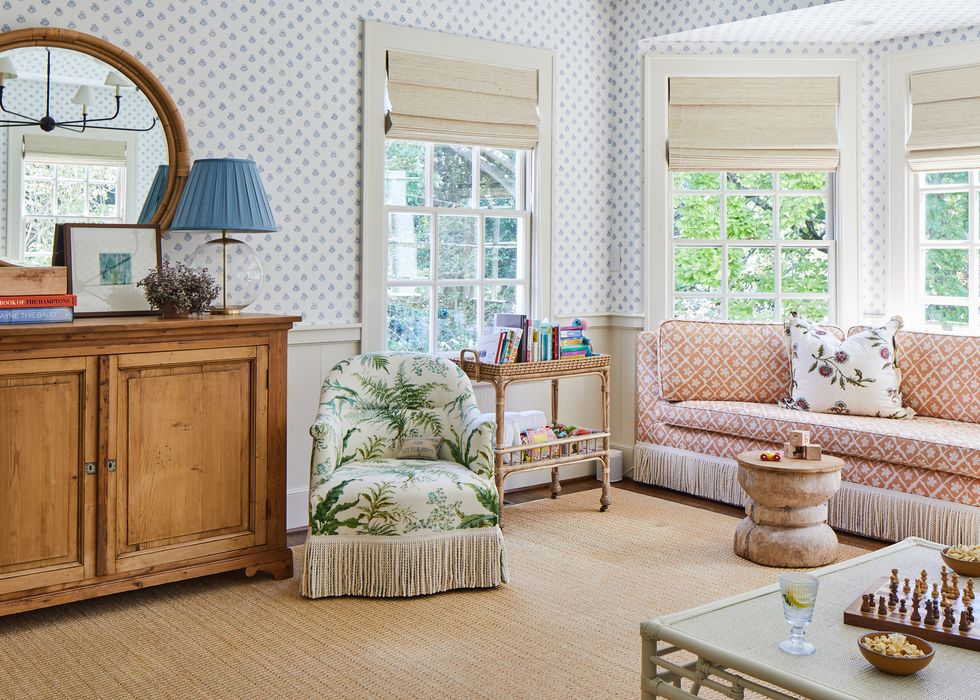
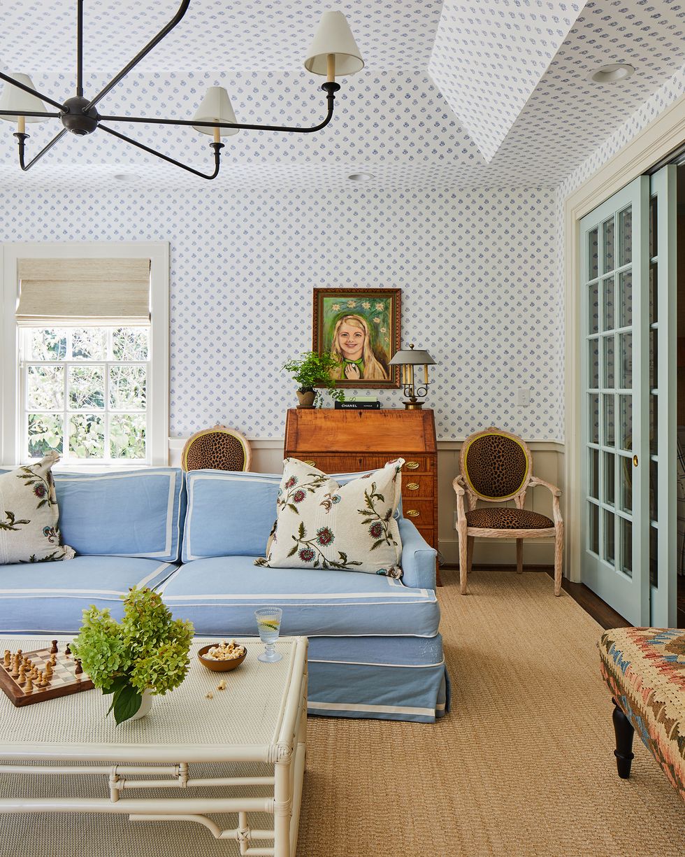
Family Room
The custom window-niche seating is upholstered in Lee Jofa fabric and accented with Sister Parish pillows. The trim, which is original to the home, is painted Farrow & Ball Clunch. A vintage cabinet adds to the high-low mix.
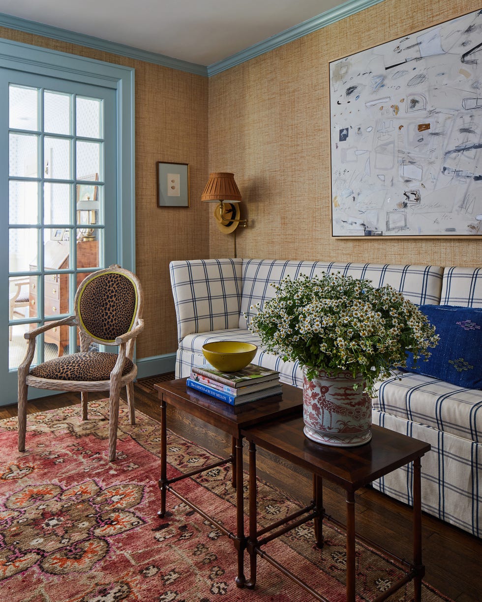
In the couple’s bar room, McGregor re-painted trim and built-in cabinetry Teresa’s Green by Farrow and Ball and upholstered a settee in menswear plaid. Wilmington’s marshes inspired the use of an earthy Schumacher grasscloth on the walls. A Caleb Mahoney art piece hangs on the wall. “Everything else is collected,” McGregor says. “It’s an eclectic mix of things.”
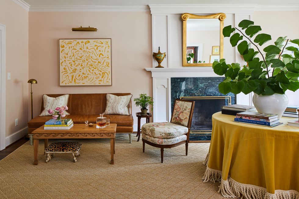
Middleton Pink was chosen to compliment an existing art piece by the client’s cousin, displayed above a leather Highland House settee. An upholstered slipper chair by Oomph features Pocantico fabric in fern by Sister Parish. The kicky stool under the coffee table was an antique store find.
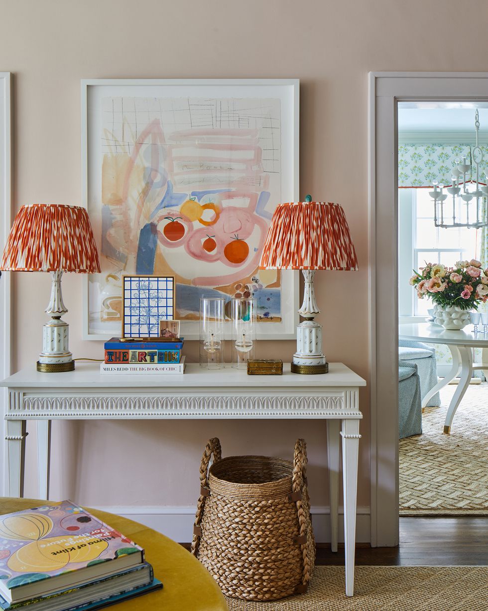
McGregor designed custom silk shades for a pair of heirloom lamps using a silk ikat fabric sourced on eBay. The colors tie into an adjacent painting by Sally Benedict and the soft pink walls.
Kitchen
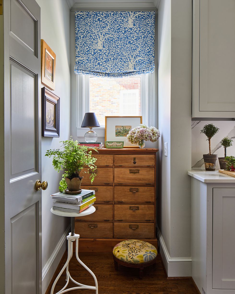
The freshly renovated galley kitchen was pre-existing. “The cabinets and the colors of the countertop—all that was done,” McGregor says. “We swapped out the lights and added all the accessories and the window treatments.”
The kitchen niche features a custom window treatment by Quadrille and an antique letter cabinet.
Dining Room
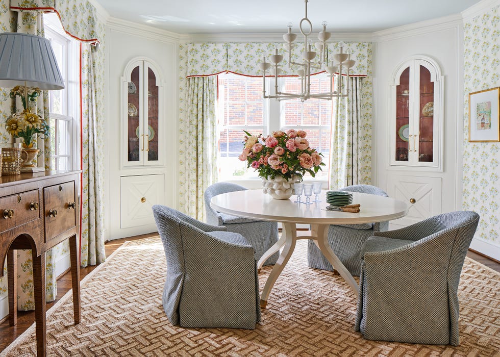
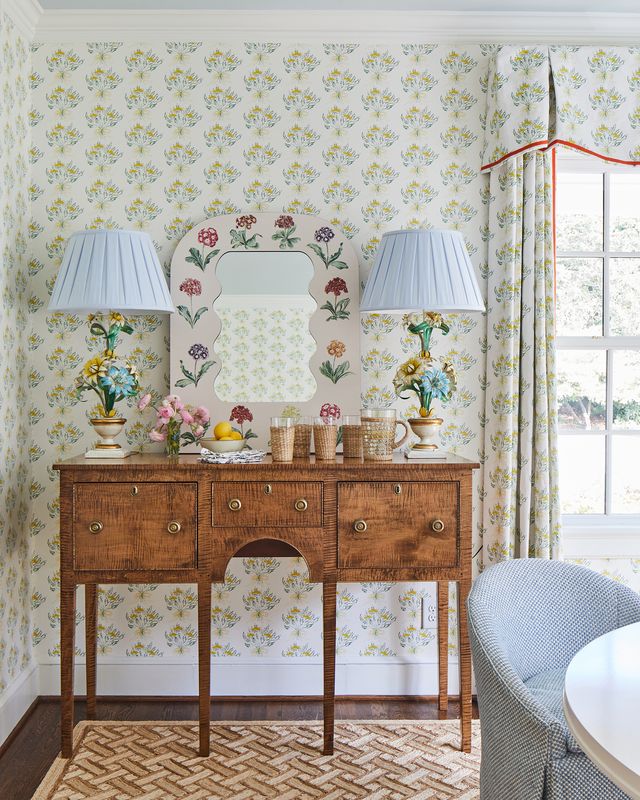
The couple’s dining room is light and bright. McGregor chose Lulie Wallace’s Bea print for the walls and window drapery. Borrowed Light by Farrow & Ball is painted on the ceiling “so it recedes visually,” she says.
The dining table and chairs are by Highland House, and the fabric is Clarence House. The floor covering is Patterson Flynn. The lemon vase is from Mance in Alexandria, Virginia.
Vintage lamps with custom blue fabric shades sit on either side of a sideboard from 1stDibs. The Primrose Mirror by Fleur Home feels right at home in the middle.
Powder Room
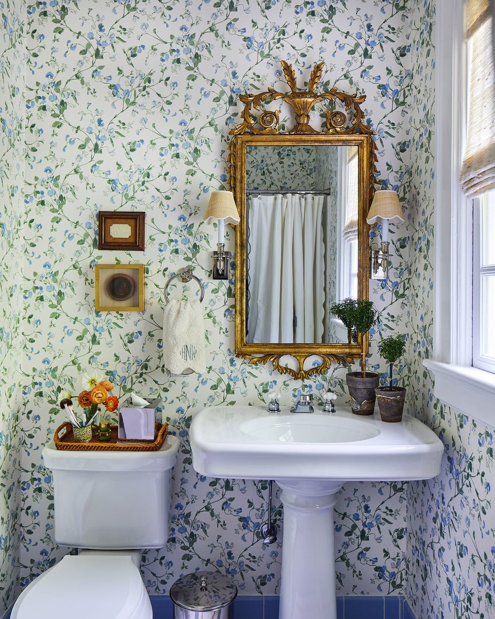
McGregor chose a blue and green floral wallpaper to coordinate with the bathroom’s original blue tilework.
Bedroom
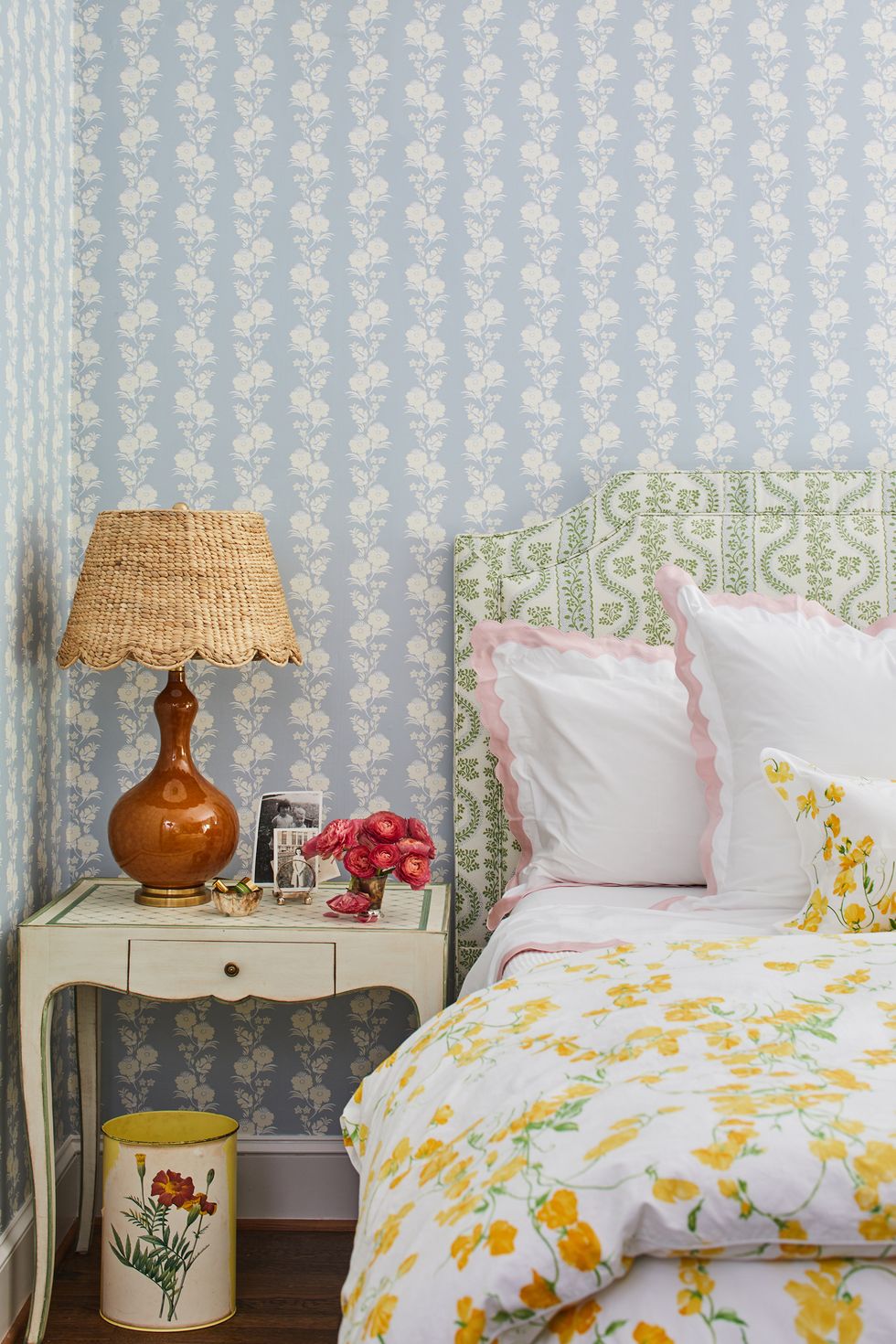
With pattern mixing on full display, a pale blue wallpaper by Cat Judice offesets verdant Dolly fabric by Sister Parish on the headboard and pink scalloped Matouk sheets
Q&A
House Beautiful: How did you transform the home?
Whitney McGregor: We had to take down some paper and re-paint some recently painted things. But it was primarily paint and furnishings. I thought, let’s work with it [the prior renovations]. We didn’t do any wall moving; we painted and installed wallpaper, furnishings, fabrics, and accessories.
HB: What was it like before?
WM: It was a bit edgy. There were a lot of really sharp colors. They wanted something softer, more traditional, more classic, but they’re young, so we didn’t want it to be older. It needed to stay fresh.
HB: How would you describe the space?
WM: It’s traditional, but it’s fresh, and it’s bright. There are certainly a lot of classical elements, but it has a young perspective.
HB: Tell me about your design process.
WM: I make sure that there’s continuity happening. And I never design for two different clients at the same time because I try to be in my client’s headspace. I always start with a floor plan, and then I build from that. I start from inspiration, but generally, there’s a spark in one element that sets something off. It can be anything. I ask clients to share their inspiration with me (and I mean everything). If you like the menu at a restaurant, I want to see it. Those things show me how you see the world aesthetically, and I want to know.
HB: What was the ‘spark’ for this project?
WM: They have a lot of coastal influence in the things they are drawn to. But my inspiration was a sunset over the marsh in Wilmington. It’s something they talked about a lot, so that’s where the pink and orange came from.
HB: We love your color selections here. What are your favorites?
WM: I certainly have color pairings that I love. I love pink and yellow together, pink with red, and pink with orange. My clients had strong opinions about colors; they have favorites, too. Orange, yellow, and green are theirs.
HB: Were there any surprises or hiccups along the way?
WM: There were some happy accidents. My client found the art in the formal living room bySally Benedict. She sent it to me, and I said, “Buy that right now.” I don’t see her do that many still lives. So that was just one of those things where it all came together. The skirted circle table in that room is another nod to classic design elements. The yellow is bright, and it was supposed to be a different fabric altogether, but the fabric was back-ordered for nine months. I said to the client, let’s do the yellow to hold you over because you love yellow; then we never changed it because we liked it so much. I thought the fringe was a nice way to finish it at the bottom. It makes it lay so nicely.
HB: What is your design mantra?
WM: Comfort is the ultimate luxury. If I had one design slogan, it’s that. I want every room to be comfortable more than I want it to be beautiful. The dining room is sunny and bright and so nice to be in. If this were my dining room, I’d sit here from breakfast until lunch. I’d read the paper, have coffee, linger and talk – so that’s how it came to be.
Follow House Beautiful on Instagram.
