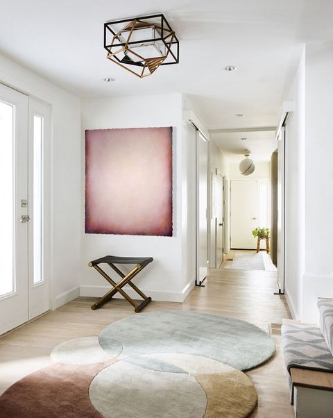
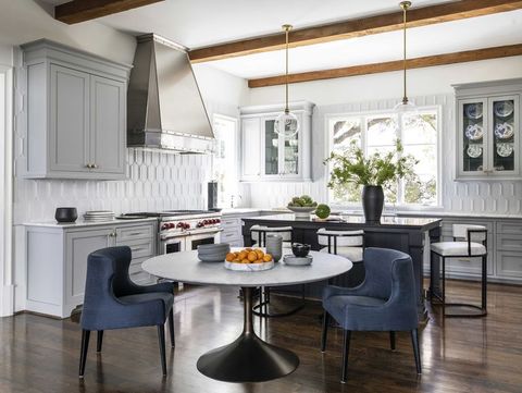
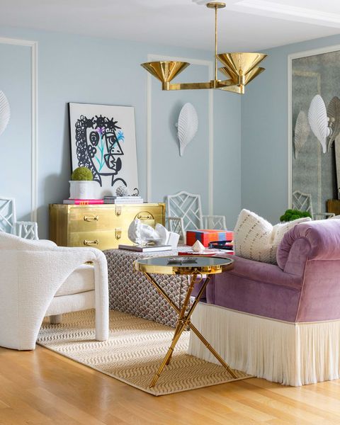
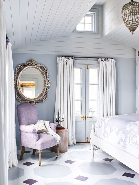
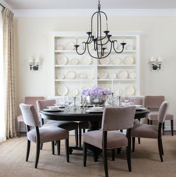
Nile Johnson sends his clients an extensive survey at the start of a project to get a sense of their wants and needs for their home. But one thing the Philadelphia designer doesn’t want to know? Their favorite colors. “I want to know how you want to feel in your home—that’s what’s really important,” says Johnson. In short, what you like isn’t always what you need.
But like many designers across the country, Johnson has seen those needs shifting since the onset of the pandemic. As the home suddenly became the epicenter of our lives, what we need from it—and how we need it to make us feel—has undergone a rapid transformation.
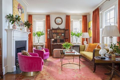
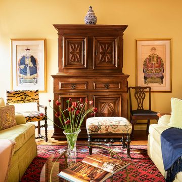
“My clients feel freer to use bolder colors—to use colors that speak to them personally,” says Chicago designer Joy Williams of Joyful Designs Studio. For one client, she recently cloaked a lounge in a high-gloss almost-black aubergine hue; for another, she’s working on a dining room in a deep red. “Two years ago, I’d get requests for an accent color, or an accent wall—even that was taking a risk. Now, they’re OK with saturating a room in color if it’s one they love.”
More From House Beautiful

Sometimes, clients are asking for color even if they don’t realize it: “There are more requests for spaces to feel more layered, have more contrast and be more unexpected,” says designer Shaun Crha, the founder of Long Beach, California, firm Wrensted Interiors, who has seen plums, baked blush tones that feel straight out of the desert, and shades of marigolds and turmeric resonate most with clients. “The pandemic has caused people to seek vibrancy and excitement in their spaces, since they’re not getting that from traveling or restaurants. It’s a pendulum swing as they lost all of those influences in their lives and started making up for it in their homes.”
Textile designer Lori Weitzner has a unique window on how COVID has changed our sense of color. In her 2016 book, Ode to Color, she identified 10 essential palettes, each one corresponding to an individual’s ambitions, emotions and sense of self. Teaming up with a psychologist, she developed an 18-question quiz to help readers identify their own color needs—questions that touch on everything from the genres of books, music, and movies they prefer to a proclivity for risk-taking and sentimentality. Weitzner offers the quiz on her website, and her data offers proof that color needs change over time.
Before the pandemic, the results reflected a need for creativity, connection with nature and relaxation, with the Alchemy, Fragrant Woods, and At Ease palettes as its most frequent outcomes—a fitting outcome in a go-go-go world. Then, starting in 2020, the graph shifted dramatically. While results for Fragrant Woods held steady (like our yearning for the outdoors), new palettes rose to the forefront: Waterside and Earthly. “I keep checking, and Waterside is by far the most up,” says Weitzner. “It’s about feeling grounded in a world that is disrupted, and about creating a world for yourself with no surprises or shocks. And Earthly is about people rethinking their lives, discovering their passions, and following through on their dreams.”
Weitzner has translated her 10 palettes into an exhibition that debuts at the Venice Biennale in April, offering an immersive experience that includes a custom scent and song for each color world. “Color is not just about what you see, it's how it makes you feel, and that's why we can use it in so many ways to help us,” she says. “My goal is that you start to think of color as a tool—and maybe even come up with your own color worlds.”
Thinking critically about color, says Johnson, has become an essential ingredient of a job well done. “As designers, we are problem solvers,” says Johnson. “People are lacking color in their world—not just on the surface, but a colorful life. Home is where we can help them meet that need.”
Which color palette are you? Find out below!
Rust, clay, aubergine. The rich, exuberant colors of Earthly remind us to follow our passions—fitting coming off the stagnation caused by pandemic lockdowns. “I always say that you can smile through life or you can sing through life. Earthly inspires you to sing,” says Weitzner. At home, she recommends incorporating terra-cotta pots or simply “starting by lighting a candle.”
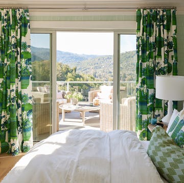
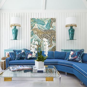
The Waterside palette, which evokes the ethereal blues of the sea and sky, is grounding and familiar. “If you had Waterside at your dinner party, they’d be there early to set up and stay late to help you clean up,” says Weitzner. For a subtle but impactful way to embrace these colors at home, paint your bedroom ceiling a barely-there shade of blue to feel closer to the heavens.
Fresh tulips, scoops of sorbet, rows of macarons in a patisserie… The Garden Party palette is all about a return to playfulness and simple pleasures. But these colors don’t have to be saccharine: Pair whimsical tones with more stately furnishings or traditional architecture. “Everyone can have their own take,” says Weitzner. “Either way, it’s a lighthearted energy.”
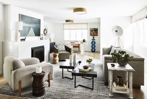
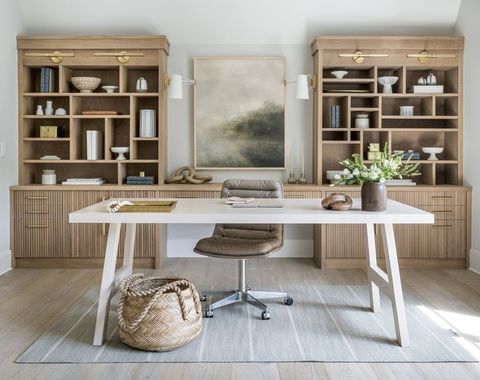
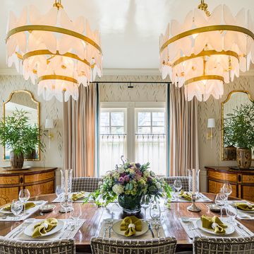
Whisper is a world awash in airy shades of white, symbolizing retreat and tranquility, a respite from the frantic flow of day-to-day life. “In order for you to really feel it, texture is an important part,” Weitzner says. Elements like a woven wall-covering or layers of textiles can go a long way in warming up white paint. For a small touch, try a silk or linen lampshade.
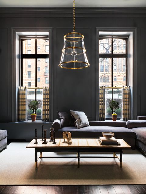
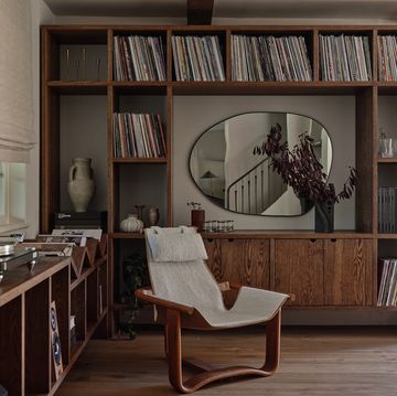
The alluring shades of a city skyline at midnight—truffle, onyx, and deep, dark browns—define the Night Shadows palette. “A room of Night Shadows is where you feel safe to share your secrets,” says Weitzner. “These saturated colors are more moody and make you feel like you’re in a place of comfort.” Bring them into your home through dark floors or ceramics in a deep glaze.
The sun-kissed honey glow of Alchemy resonates most with imaginative individuals who are distanced from their craft. (Think interior designers bogged down running their businesses, yearning for more hands-on time.) “Any building you’ve been in with gold leaf—something happens to you, and you feel transported,” says Weitzner. That’s the feeling Alchemy should inspire in the everyday.
With a subtle shimmer, like the gossamer strands of a spiderweb or Harry Potter’s Patronus, Silverlight represents innovative ideas that have been put on the back burner. “These colors can put you back in touch with what you love and with the ideas you’ve been too busy to focus on,” Weitzner explains. Incorporate them by way of gleaming mirrors, frosted glass, or even thrift-store crystal.
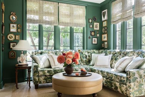
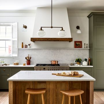
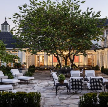
Verdant, beckoning shades like those in a dappled pine grove distinguish the Fragrant Woods palette, which centers around feelings of sentimentality, physical touch, and wellness. It’s about slowing down, being present, and connecting with nature. Wood flooring and furniture tap into this essence, as do sensory experiences like using a paper calendar or nurturing a houseplant.
Like a Dr. Seuss dreamworld, the Out Loud palette offers endless possibilities, an injection of energy. Bold, daring colors inspire us to be courageous and uninhibited. Choose hues from this palette for a home office, Weitzner says, to put yourself in a creative mindset. A persimmon sofa would make a major impact, or you can just add vibrant artwork or flowers to boost your space.
A haven of sun-bleached grasses and sand shades is endlessly versatile. The natural linen tones of At Ease are perfect for those who simply want to come home and relax. “Linen-colored sofas are genius,” says Weitzner, as they allow you to completely unwind. Plus, they’re mutable. Layer pillows and blankets from other color worlds over them as your needs change.
Follow House Beautiful on Instagram.
