Skip to Content

The Best Gray Paint Colors, According to Interior Designers

There's a gray for every room.
By Emma Bazilian and Jessica Cherner
gray paint
Farrow & Ball

When you think of a gentle hue that will give your space a coveted bright and airy feel, gray paint colors don’t usually come to mind. However, there’s something to be said about a few misty tones that can set the mood—no matter the room. Some may even go so far as to say that gray could be the new beige. In fact, we asked 40 interior designers their thoughts on the color gray, and we were pretty blown away by their responses.

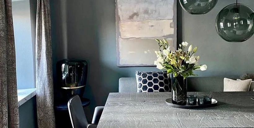
Some use go-to grays that create an ethereal look, while others prefer a darker shade for a moodier feel. Gray is definitely on trend at the moment because it’s more versatile than we give it credit for. Whether you’re aiming for bright and crisp or warm and cozy, there’s a gray that will accomplish the task.

Ahead, discover how these design experts use gray in their spaces. You may even be inspired to push your furniture to the middle of the room, drape it in a tarp, and pick up a paintbrush like a pro. Our suggestion? Think about what kind of look you’re seeking—pale and gentle or bold and dramatic—and order a few samples. Once you’ve made your choice, it’s time to get to work. Let these 40 shades from the likes of Benjamin Moore, Farrow & Ball, and more get you started. Who knows? Maybe gray paint colors will overtake blue and white! The jury is still out, but we have a feeling, 2023 will be gray's year, and we’re here for it.

Stormy Sky 1616 by Benjamin Moore

stormy sky 1616 by benjamin moore
Benjamin Moore

“I love using this hue because it is elusive. Like its namesake, Stormy Sky can be dramatic but also translucent. I’ve used it everywhere from exteriors to kitchens, where it looks beautiful with white accents and metal finishes. This paint also works well as a base for other colors—I’ve even done 50-50 mixes with it!” –Windsor Smith

BUY NOW

Alpaca SW 7022 by Sherwin-Williams

gray paint blob

"This transitional, warm greige is a great go-to for bedrooms and cabinets if you want a light color, but not white." — Bailey Austin

Buy Now

Blue Gray No. 91 by Farrow & Ball

farrow and ball
Farrow & Ball

“This is not really blue and not really gray. It’s kind of creamy-dreamy, like a beautiful cloud. I think of an office as a place where you just want to be restful and creative, and this is very calming—and very chic with a pop of navy or lavender. It’s a blank canvas for whatever you’re doing at the moment.” — David Phoenix

Buy Now

Advertisement - Continue Reading Below

Alaskan Skies 972 by Benjamin Moore

alaskan skies 972
Benjamin Moore

"Appropriately named, Alaskan Skies offsets our state's dramatic change of lighting conditions throughout the year by serving as a neutral base for contrasting interior finishes, all while maintaining an uplifting atmosphere." — Bauer/Clifton Interiors

Buy Now

Mindful Gray SW 7106 by Sherwin-Williams

gray paint blob
Sherwin-Williams

"Connecting texture with quiet serenity was my recipe for a modern-glam home found in the mountains of Utah. Mindful Gray offered a respite that embraced all of the rugged textures." — Anne Marie Barton

Buy Now

Down Pipe No. 26 by Farrow & Ball

gray paint
Farrow & Ball

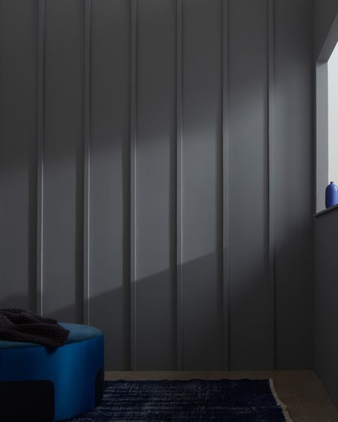
“Lately, I’ve been having a good time with this deep gray. It changes a lot in different conditions. When the room is dark or in shadow, it seems almost black. But in direct sunlight, it’s the color of a Baltic afternoon. So it’s not boring. It also goes well with caramel leather chairs—something I can imagine putting into almost any office.” David Netto

Buy Now

Advertisement - Continue Reading Below

Moonshine 2140-60 by Benjamin Moore

gray paint
Benjamin Moore

“There is something about this shade that you can’t quite pin down. It reminds me of mist and fog—a little hazy and soothing. The pale gray manages to be versatile without being boring: It works in a variety of situations, from a light-filled bathroom to a spacious living room. On walls, it’s subtle yet powerful enough to create dimension.” — Michele Dopp

Buy Now

Titanium OC-49 by Benjamin Moore

gray paint
Benjamin Moore

"Benjamin Moore Titanium is a soft, luminous off-white, with a little green in it that is bright enough to light up our often rainy weather here in Oregon." — Jessica Helgerson

Buy Now

Parma Gray No. 27 by Farrow & Ball

gray paint
Farrow & Ball

“A beautiful blend of blue and gray that approaches robin’s egg but is chalkier and more elegant. It’s soothing and deep and will remain relevant as the child grows. For a boy's room, bring in café au lait tones and pops of strong olive green. For a girl, ground the room with dove gray and lavender accents.” – Amanda Nisbet

Buy Now

Advertisement - Continue Reading Below

Himalayan Trek 1542 by Benjamin Moore

gray paint benjamin moore
Benjamin Moore

"This fantastic neutral is great for both modern and classical interiors. A perfect balance of cool and warm, it's also remarkably similar to our local Chicago limestone." — Tom Stringer

Buy Now

Revere Pewter HC-172 by Benjamin Moore

gray paint
Benjamin Moore

“This is the absolute perfect greige. No need to look any further. And it’s amazing with a brighter contrasting trim. I love it so much that I’ve used it in three of my homes. In light-flooded rooms it feels cool and crisp. In darker, cozier rooms it’s very soothing.” — Shawn Henderson

Buy Now

Granite AF-660 by Benjamin Moore

granite af660
Benjamin Moore

"For a warm brown-gray, Granite is one of my favorites, bringing coziness and sophistication to any room. This color invites you to curl up next to a fire." — Alice Williams

Buy Now

Advertisement - Continue Reading Below

New Hope Gray 2130-50 by Benjamin Moore

new hope gray 213050 benjamin moore
Benjamin Moore

“I call this blue-gray a ‘shadow color.’ It changes with the light, which makes it interesting to enter a room throughout the day. This particular hue conjures images of the ocean and the sky—ideal for a tranquil Southampton beach house, where I used it on kitchen cabinets. It provided a punch of color without being too over-the-top.” — Sandra Nunnerly

Buy Now

Gull Wing Gray 2134-50 by Benjamin Moore

gull wing gray 213450 benjamin moore
Benjamin Moore

“This blue-gray, in an eggshell finish, feels like an icy drink on a hot day. It visually cools off a room that gets loads of light. And then you can build in some warmth with layers of color and texture in the furnishings. I’d bring in earth tones like chocolate brown, rust, and mustard gold, and maybe pop it with a hit of turquoise.” – Scott Laslie

Buy Now

Silver Peony SW 6547 by Sherwin-Williams

gray paint blob
Sherwin-Williams

"Having both southern and western sun exposures in a room can be tricky, but this unusual color changes with the time of day from a cool lavender in the morning to the warmest of blush in the evening." — Kevin Walsh

Buy Now

Advertisement - Continue Reading Below

Classic Gray 1548 by Benjamin Moore

classic gray 1548 benjamin moore
Benjamin Moore

"This neutral is so versatile and offers a cool and calm retreat from the heat. Art hangs beautifully on it and it lets the room be the showpiece, not the paint color. Our design studio is painted this color and we love the environment that it creates!" —Nancy Price

Buy Now

Granite Dust MQ3-6 by Behr Paint Colors

gray paint blob

“I placed this color—a pale gray that resembles a hazy sky—in a lacquered finish on the ceiling of a small black-and-white-striped foyer. The glossy effect is easier to get on a ceiling than on walls, while the reflective, mirror-like surface gives much-needed depth to the room. The shade is also a bit somber, which helped balance the bold walls.” – Rinat Lavi

Buy Now

City Shadow CSP-60 by Benjamin Moore

city shadow csp60 benjamin moore
Benjamin Moore

"Gray skies and a misty rain can be quite beautiful and comforting. Benjamin Moore’s City Shadow captures this cozy feeling perfectly. Brighten it up a bit with unlacquered brass fixtures and hardware and pair alongside Calacatta marble. You can’t go wrong!" — Katie Hackworth

Buy Now

Advertisement - Continue Reading Below

Railings No. 31 by Farrow & Ball

railings no 31
Farrow & Ball

“I used this cool-toned, blackened-steel shade on the stair spindles of my own home. The color really pops against the neutral palette of the space around it. My advice for working with a slick finish: Make sure the raw surface is free of any blemishes, because once you apply the paint, the shine will magnify them!” – Christine Stucker

Buy Now

Wickham Gray HC-171 by Benjamin Moore

wickham gray hc171 benjamin moore
Benjamin Moore

“I’ve been known to go on a gray streak, in every shade from steel to a warm French gray. No matter the gray, it becomes a serene backdrop for everything—flowers, books, art, fabrics, or people. I like bordering gray with white trim, white fabrics, and white furniture. Sometimes I pop a little red here and there. But you want to be careful when picking your gray—nothing too sad, cold, or dingy.” – Matthew Patrick Smyth

Buy Now

Watch Next
 
preview for Home Tours

Color Is Everything

Advertisement - Continue Reading Below
Logo
twitter icon
youtube icon
facebook icon
instagram icon
pinterest icon
Hearst Lifestyle and Design Group - A Part of Hearst Digital Media

A Part of Hearst Digital Media

We may earn commission from links on this page, but we only recommend products we back.

©2023 Hearst Magazine Media, Inc. All Rights Reserved.

Privacy NoticeCA Notice at CollectionYour CA Privacy Rights/Shine the LightDAA Industry Opt OutTerms of UseSite Map
Cookies Choices