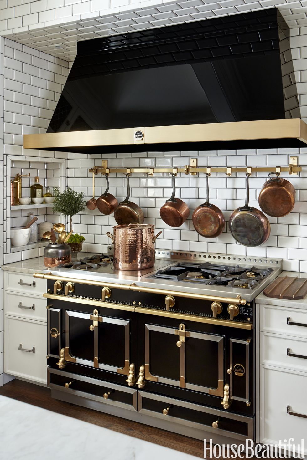
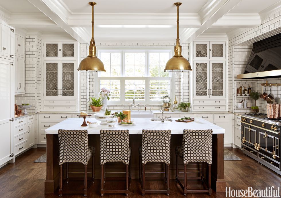
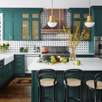
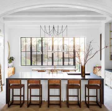
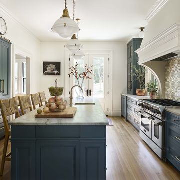
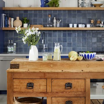
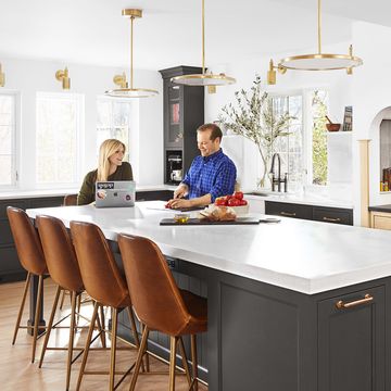
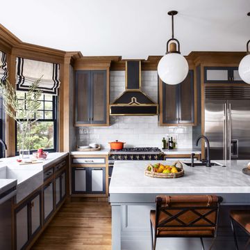
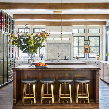
For clients with a background in the restaurant biz and an appreciation for straightforward design, Rebekah Zaveloff created a scullery-inspired kitchen in their East Grand Rapids, Michigan, home. Taking her cues from commercial kitchens, she brought in no-nonsense accents, like overscale Circa Lighting brass pendants and acres of simple white subway tiles (with charcoal grout to hide grease stains!). The result: a kitchen as good-looking as it is hard-working.
1. Organization
More From House Beautiful

Frustrated by a previous home's kitchen, in which the view outside the window dictated the layout, the clients' expectations here were simple: "Create a place for everything." To improve workflow, Zaveloff positioned flatware drawers next to the dishwashers, spice drawers beside the range and cutting boards in a divided drawer within the island.
2. Surfaces
"Kitchens dripping in marble can get too fancy," Zaveloff says. Deploying the luxe material strategically, she topped the walnut island with a 2 ½ inch-thick slab of Calacatta marble‚ then used heat-resistant, tough-wearing Hastia quartzite for the perimeter counters. A natural stone quarried just like marble, quartzite is "almost immortal."
3. Sinks
"My instinct is never to match everything. That can get really boring," Zaveloff says. When it came to selecting the kitchen's sinks, she went with a traditional English farmhouse double-bowl style from Rohl and a French-influenced hammered-metal prep sink from Waterworks. "They're different, but not so much that they clash," she says.
4. Proportions
In the builder's original blueprint, the island was a massive 8-foot square — dramatic, but not exactly practical for a family. Zaveloff knocked a few feet off to create a work area that's scaled for meal prep, without the need to run laps. "Bringing everything in closer is not only cozier, it also makes cooking, cleaning and grocery unpacking a lot less aerobic."
5. Cabinets
To break up what could have quickly become a monotonous wall of solid white cabinets, Zaveloff commissioned a British company to craft wire-mesh door inserts overlaid with a metal diamond pattern. Unlike transparent glass doors that show everything (so shelves have to constantly be neat), the haziness of these custom inserts adds a little mystery to the contents of the cabinets.
6. Mood Lighting
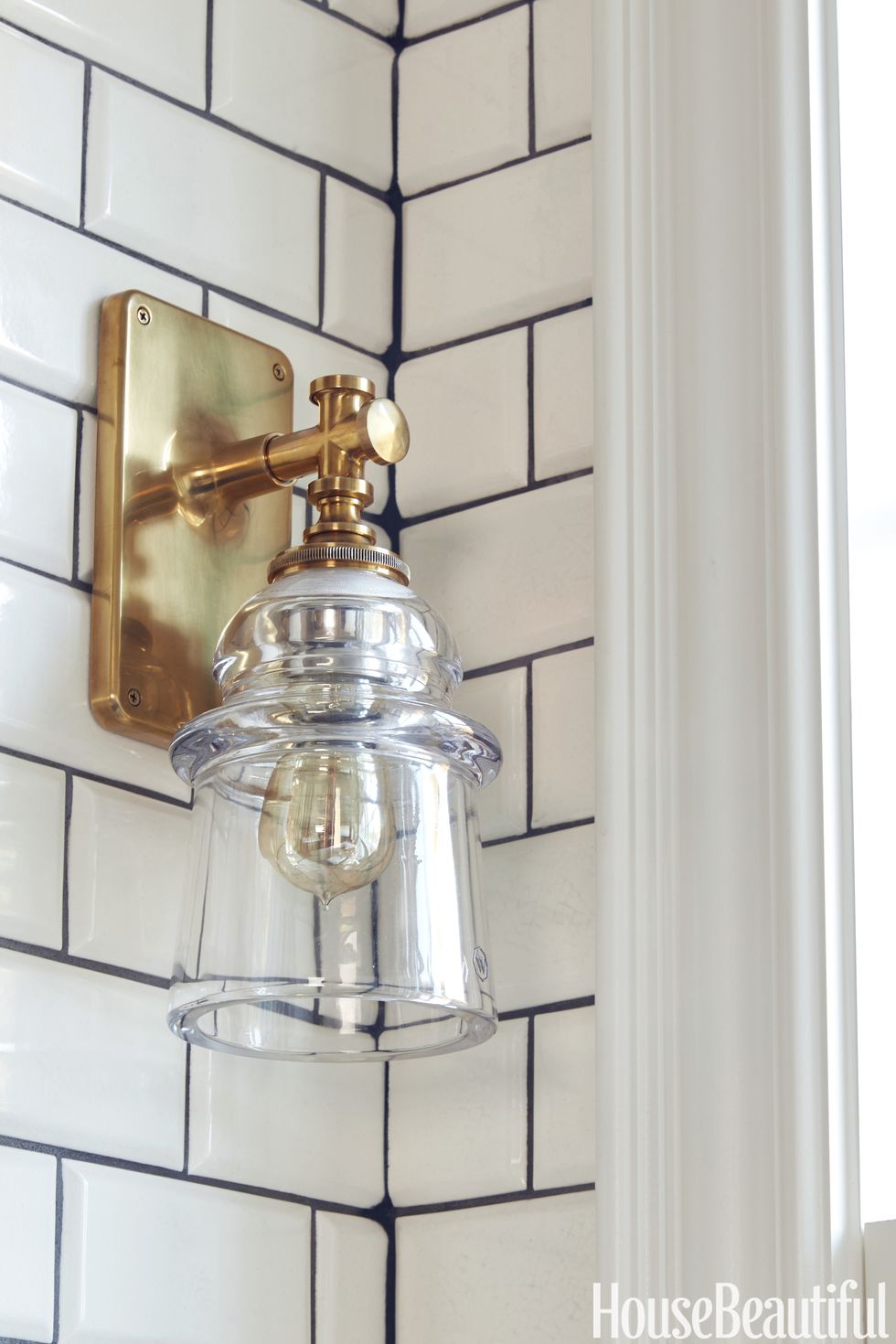
The clients went gaga for Waterworks' utilitarian Watt sconces, which are modeled on telephone-pole insulator covers, but Zaveloff was unsure of where to mount them. Rather than nixing the fixtures, the designer had tiled columns constructed next to each window and installed the sconces there. At night, the family switches them on as a low-light alternative to the brighter overheads.
7. Fast Access
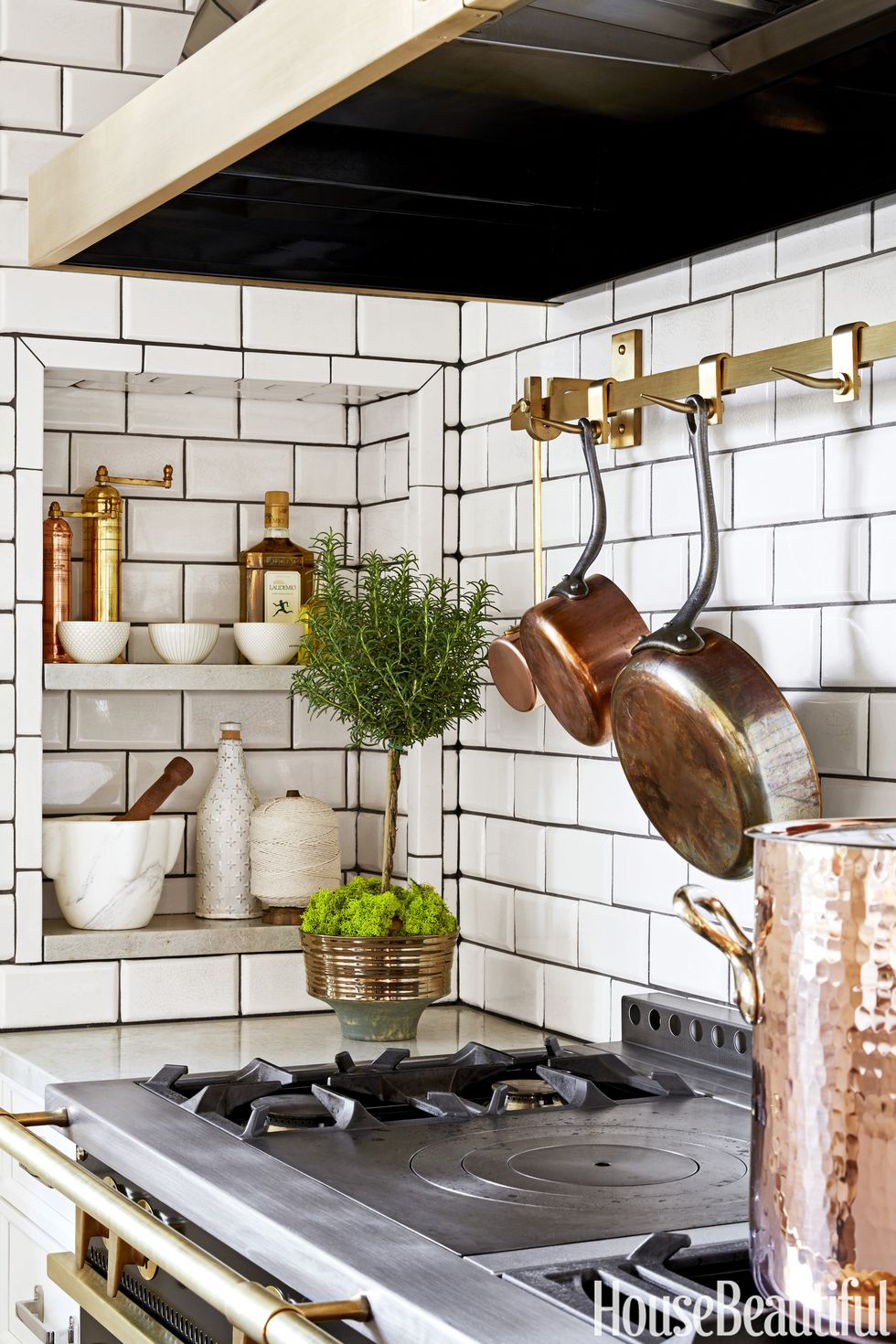
A built-in stove-side niche puts everyday seasonings within arm's reach, while a pot rack mounted above the La Cornue range keeps well-used copper cookware where the action is.
8. Butler's Pantry
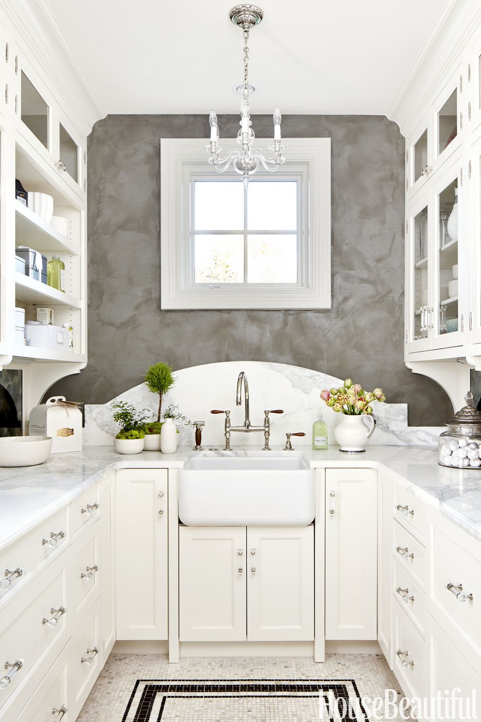
As a 180-degree departure from the function-first kitchen, Zaveloff designed a feminine pantry inspired by turn-of-the-20th-century manor homes. "It's less a butler's pantry and more of a lady-of-the-house pantry," she says. To up the elegance, Zaveloff had the walls done in a gray Venetian plaster, chose white marble countertops and curved the top of the backsplash. The final touches: a romantic Circa Lighting chandelier and antique mirrors as backsplashes on the sides.
See something here you like? Check out our shopping guide for where to find it.
This story originally appeared in the March 2017 issue of House Beautiful.
